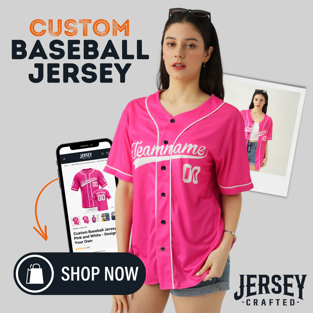
Shoulder logos can turn a good custom baseball jersey into a signature piece—if you place them with discipline. The shoulder is premium real estate: it’s visible in dugout photos, handshake lines, and post-game interviews. Here’s how to add patches and shoulder logos that look intentional, balanced, and broadcast-ready—without crowding your jersey.
1) Decide the Job of the Shoulder
Every graphic needs a role. Pick one primary purpose for each shoulder:
-
Identity: Mascot head, alternate mark, or “JC” monogram.
-
Commemoration: Anniversary, tournament badge, Senior Night, memorial ribbon.
-
Sponsor: Brand logo sized for visibility without stealing the show.
If a mark doesn’t fit one of these roles, it’s visual noise—move it to a warmup top or fan tee.
2) Establish Visual Hierarchy (Before File Prep)
Hierarchy keeps the jersey from feeling busy.
-
Tier 1 (Front wordmark + number): Must read first from the stands.
-
Tier 2 (Back number + NOB): Game-critical readability.
-
Tier 3 (Shoulder logos/patches): Flavor and story—never outshine Tier 1–2.
If a shoulder logo competes with the chest number at 20–30 feet, reduce its contrast or size.
3) Right vs. Left Shoulder: What Goes Where?
-
Team Identity → Left shoulder. It photographs with the heart side and feels traditional.
-
Event/Sponsor → Right shoulder. Keeps storytelling separate from core identity.
-
Dual logos? Make one clearly dominant (5–8 mm larger) so the eye doesn’t ping-pong.
4) Safe Margins & Sizing That Always Works
-
Standard adult size: 70–85 mm width for circular/crest patches; 60–75 mm for tall icons.
-
Vertical clearance: Keep 15–20 mm from the sleeve cuff/piping to avoid sewing distortion.
-
Neckline clearance: Minimum 25 mm from shoulder seam so collars and shoulder seams don’t clip the patch.
-
Youth jerseys: Scale down to 60–70 mm max; shorter sleeves magnify logos.
Rule of Thumb: If your shoulder logo equals or exceeds the height of a single chest numeral stroke, it’s too big.
5) Shapes That Stay Clean on Sleeves
Sleeves curve—your patch should too.
-
Most forgiving: Circle and soft shield shapes ride curves without wrinkling.
-
Trickier: Tall rectangles and thin banners; they buckle near the cuff. Consider adding a contour border to visually round corners.
-
Micro-badges: Use for multi-year marks (e.g., “Est. 1978”). They should be tone-on-tone so they don’t add a new focal point.
6) Materials & Methods (Readability vs. Weight)
-
Embroidered patch: Textured, premium, slightly thicker; best for simple shapes and bold lines.
-
Tackle twill applique: Luxe look for letters/monograms; combine with zig-zag stitch or satin border.
-
Printed heat-transfer (PU): Super crisp for detailed sponsors; keep to 1–2 colors for longevity.
-
Woven patch: Highest detail for crests; pair with a subtle merrow edge in jersey color to minimize “sticker” effect.
If your jersey already uses tackle twill numbers, prefer a flatter shoulder method (woven/print) so the whole piece doesn’t feel heavy at the arm.
7) Color, Contrast, and “Crowd Control”
-
Use jersey colors first. Pick two core colors + one accent max.
-
Outline for lift, not loudness. 1.5–2.0 mm outline is enough to separate the patch from green fields or brown infields.
-
Sponsor adaptation: Convert sponsor marks to one-color versions (brand-approved) to avoid introducing a fifth hue.
Quick test: Convert your mockup to grayscale. If the shoulder outshines the chest number, reduce contrast or size.
8) Avoid Conflicts with Piping & Cuffs
-
If your sleeve has contrast piping, center the patch above the piping line or well below—never straddle it.
-
On short cuffs, move the logo closer to the shoulder seam so the cuff reads clean in photos.
-
Raglan sleeves: Keep the patch inside the raglan seam triangle for better symmetry.
9) Multi-Logo Strategy (Sponsors + Team)
When you need two shoulder elements:
-
Stack roles, not logos. Example: Left shoulder = crest; Right shoulder = sponsor.
-
Use scale to define priority. Team crest at 80 mm, sponsor at 65–70 mm or 1-color.
-
Cap it at two. A third shoulder element belongs on the hem tag or back yoke.
10) File Prep That Saves a Week of Back-and-Forth
-
Vector files: AI/SVG/PDF only; expand strokes and outline text.
-
Bleed & edge: Add 2–3 mm of safe area for embroidered/woven edges.
-
Pantone callouts: Provide Coated/Uncoated and RGB fallback; avoid CMYK drift on heat transfers.
-
Minimum line weight: Keep smallest strokes ≥ 1 mm for embroidery, ≥ 0.6 mm for PU print.
Include a flat and curved mockup (sleeve wrapped at ~30°) so the client sees real-world distortion.
11) Proofing Checklist (Use Every Time)
-
✅ Logos don’t cross seams or piping
-
✅ 25 mm neck/shoulder seam clearance
-
✅ Left vs. right role assignment clear
-
✅ Patch size < chest numeral focus
-
✅ Contrast test in grayscale passes
-
✅ Youth scaling listed in the proof
-
✅ Single source of truth CSV (size → patch size if you scale by garment)
12) Photography Tips to Show Shoulder Details Online
-
45° half-turn pose to reveal chest + shoulder in one frame.
-
Top-down crop for flat lays—place the patch in the upper third.
-
Hand-to-shoulder touch adds scale and draws attention naturally.
-
Raking light (from behind and above) brings out embroidery texture without glare.
When Shoulder Logos Meet Special Nights
Designing for Senior Night, rivalry games, or a commemorative season? Anchor the story with one clean shoulder mark and move secondary details—like dates or class years—to a hem tag or inside placket. For broader ceremony design (colors, typography, photo playbook), check our guide: Senior Night Style Guide: Custom Jerseys That Celebrate the Class of ’26.


